|
Note: All reference photos used for my artwork are either my own or my sister's (used with permission, of course), unless otherwise stated. What makes a color look real and true? Simply put, the answer is complexity. To add depth to a drawing and to make it look more life-like, you need to use a range of colors for any one particular color. And it's important to take into account real life transparency. Let's look at some examples to further explain what I mean. Keep in mind, I use Faber-Castell Polychromos pencils, which work well for me in getting the effect I need. The most obvious example are shadows. You may want to grab gray or black to draw them. But before you do that, you need to look through the shadow. What is behind it? You need to make sure you draw what the shadow is crossing and then take your gray tones and layer over the top of that. Shadows don't block out color, merely shade it. 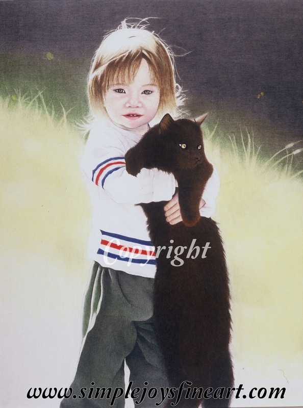 "Crystal and Friend" (2002) You can see the underlying red tones on the cat, and, believe it or not, many of the colors of her pants are blue and yellow (with some grey and dark greens). The upper, shadowy background has green and yellow underneath. This was my first piece with a person so my face/skin skills were still undeveloped. Even the blackest shades will benefit from 'background' color. I always block in a color before I layer a darker shade or black. With black hair, it is common for me to use reds or blues first. I may also use a color to burnish over the black. Not sure which color to use? Find where the lightest area and use the color you find there. So what about colors? A good rule of thumb when using secondary or intermediate colors is to use the colors that make them, not the color itself. Need purple? Use blue and red. Need orange? Use yellow and red. Need green? Use blue and yellow. You get the idea. Be sure to carefully analyze every color of your reference as you are putting it on paper. See how many colors you can find in the color you are looking at. Obviously some will have more than others. A pale pink probably will only have 2-3 colors you might use. Skin tones on the other hand will use many more. I might use over a dozen on skin tone alone! 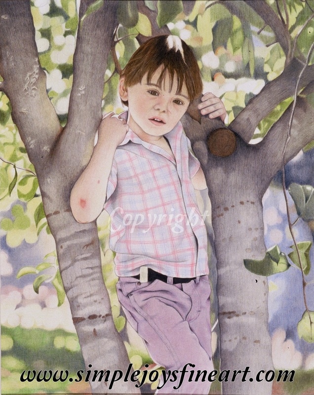 "Dusty" (2003) While I was still struggling a bit with facial features, this has some good examples of color blending. On his pants, I used light blues and pinks to compliment the purple pencils I used. The trees included browns and some indigo blue to avoid the them being 'flattened with only gray. Primary colors sometimes can be more challenging, but you will probably rarely need a true primary color. Take a minute to think about how often you see primary blue, red, and yellow in natural life. Probably not very often. And when you do, there will be at least some shadows that tell you it's a 3D object. When you look at a blue, red, or yellow, really take the time to use your eye to see what other color(s) may be 'hidden' there. Notes to take away-
 "Guiding Hands" (2009) While this piece still shows room for growth and maturity in rendering skin tone, you can see that colors can be quite complex!
4 Comments
Linda slaght
4/4/2017 03:46:10 pm
Really awesome information. I'm just beginning to learn CP and so this was really helpful to me! Thank you! 4/4/2017 04:27:19 pm
I'm so very glad you found it helpful! I will be posting regular topics weekly. Material Mondays, Technique Tuesdays, Work in Progress Wednesdays, Throw Back Thursdays, Featured Artist Fridays, Share It! Saturdays, and Simple Joys Thursday. Many will be blog posts, others will be facebook posts. If you want to stay informed on blog posts, click on the RSS feed button above (I think that's how that works!). And you can find me on facebook at https://www.facebook.com/SimpleJoysFineArt/ Happy Drawing! :)
Sheliah Lonian
4/5/2017 06:09:59 am
Very well written. Thank you for taking the time to put pen to paper. Leave a Reply. |
Author
Wendi Gunter is a colored pencil artist living in north-central Idaho with her husband, 5 children, and a menagerie of farm animals and pets. Drawing keeps her sane. Archives
June 2019
Categories |
 RSS Feed