Simple Joys Fine Art
|
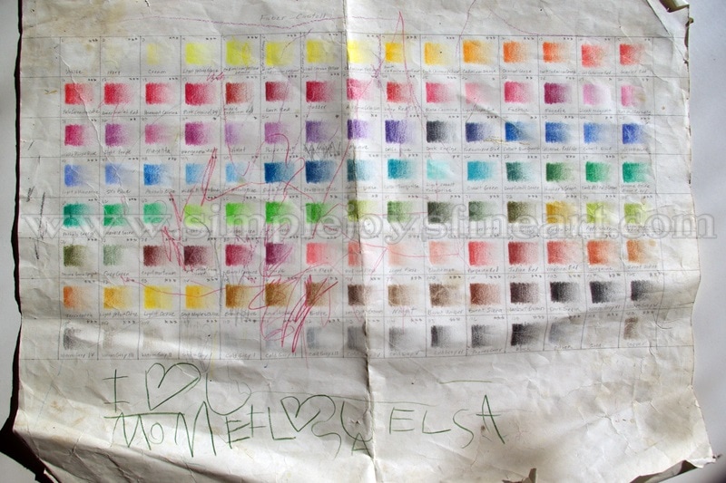
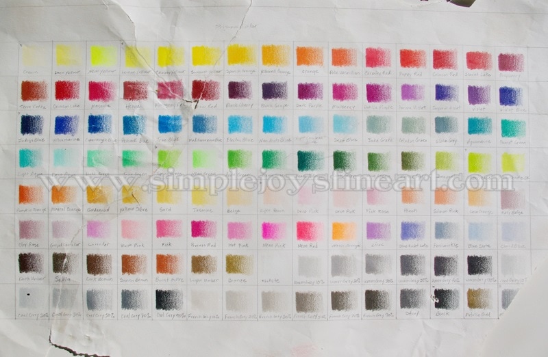
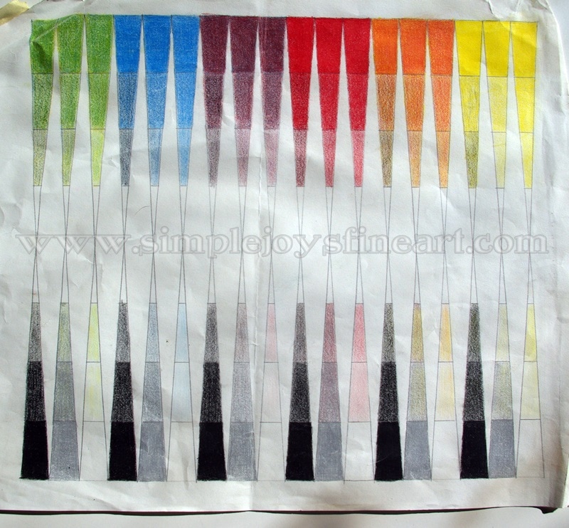
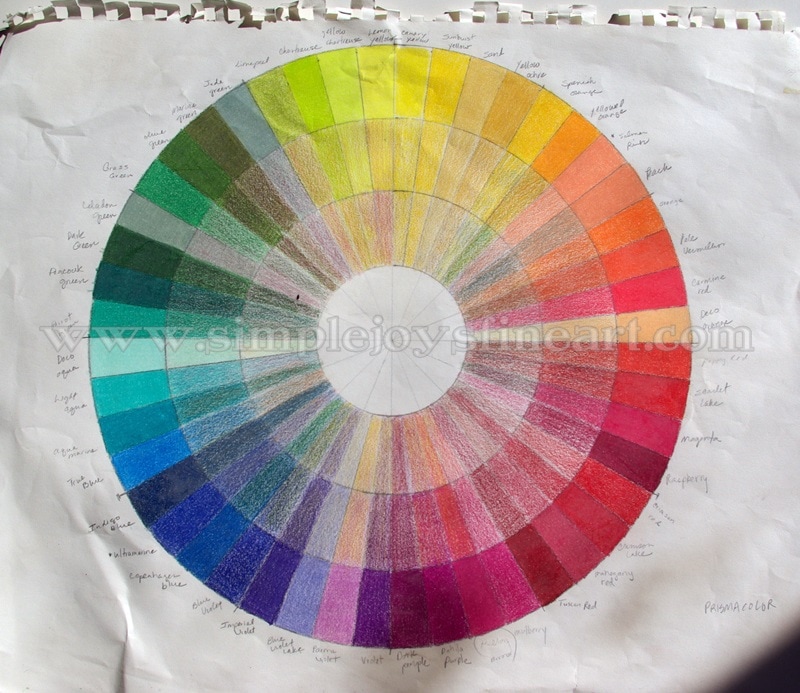
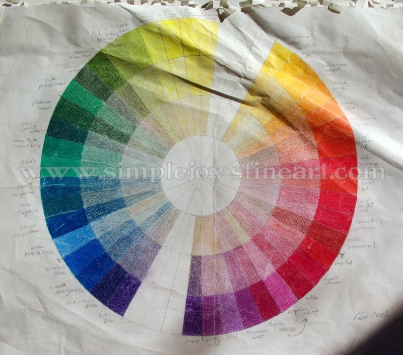
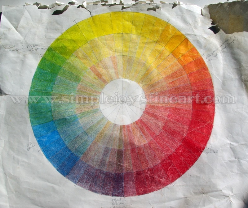
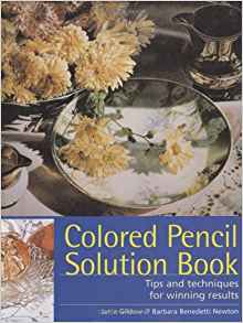
A brief note on the photos accompanying today's blog. These exercises were done almost 17 years ago when I received my full sets of Faber-Castell Polychromos and Prismacolor pencils. These papers have been well loved. They have been taped to my wall easel, hauled to art classes, used as a memo pad by my sweet daughter, and have spent time in boxes and drawers. Some day I will do new ones, but they have been so faithful (and personalized) that I haven't gotten around to it. They have their fair share of wear and tear, but I hope you will be able to look past that and see their purpose. I always like to start with the basics. Last Tuesday, I talked about color complexity. (read that post HERE), but how do you know which colors to choose and mix together? I'm going to assume that you are somewhat schooled in primary, secondary, and tertiary (intermediate) colors and jump to the second challenge- learning the personalities and characteristics of your particular pencils. The mail has arrived and in it is a box and inside the box is a tin of 120 colored pencils, glorious in color (I'm guessing I'm not the only one with a thing for pretty colors...), shiny new, and, depending on the brand, freshly sharpened and ready to use. But first, introductions need to be made! However, where do you start with these complete strangers? I'll tell you what I did. I pulled out a large drawing pad and used each and every pencil! I did several exercises and will explain each below. The first thing I did was make a grid of 120 squares for both the Polys and the Prismas. Then, with each pencil, I made gradient color in a box, making note of which pencil was used. This also helped me to learn what names went with each color as I was a rank beginner as I had only ever used graphite and charcoal. And I learned to control application. One of my most treasured possessions- an autographed copy of my color chart for the Faber-Castell Polychormos pencils. Color chart for the Prismacolors (of which another child tried to turn into a puzzle...) In order to practice shading, I did the exercise below where I started with a color on one side and black on the other and began to overlap the two as I worked to middle. For this exercise, I only used primary and secondary colors. This paper is not marked, but I believe I used the Prismas. Note: When working on a piece of artwork, I never use just one color and black together! This next exercise was a lot of fun as I familiarized myself with layering complementary colors. I drew a circle and divided into 48 'slices'. I then took the brightest/darkest color values and filled in the outside ring. I did this for both brands of pencils. The Prismacolors wheel has more colors than the Faber-Castell Polychormos wheel as the Polys didn't have as many to use of the values needed for that purpose. I made sure to record the name of each pencil I used for reference. Lastly, I overlapped each color with the one across from it, lightening the value as I went towards center. Top: Prismacolors Bottom: Faber-Castell Polychormos I had a blast with the final exercise. This is the one that still gets hauled around a lot to the art classes I hold for children. I ask them, "How many colors did I use here?" I always enjoy hearing their responses and then telling them, "Three!" Yes, I only used 3 Polys for this wheel, the three primary colors- red, blue, and yellow! And, as in the previous exercise, I overlapped complementary colors in the middle rings. If you are just beginning in colored pencil, I encourage to try these and any other exercises you come up with! It really helps to be familiar with each color, what it can do, and how each works together with the others. Ultimately, after doing all these, I decided that I preferred working with the Polys. That was a personal choice and one that these exercises may help you decide for yourself, as well! The ideas and instructions for most of these exercises came from a wonderful book that I used to get started with colored pencil. It is the "Colored Pencil Solution Book" by Janie Gildow and Barbara Benedetti Newton. Click on the title or book image for a link to Amazon. Note: This is not an affiliate ad, just giving credit and making a personal recommendation.
0 Comments
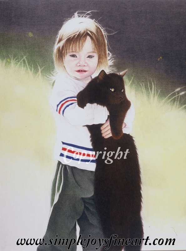
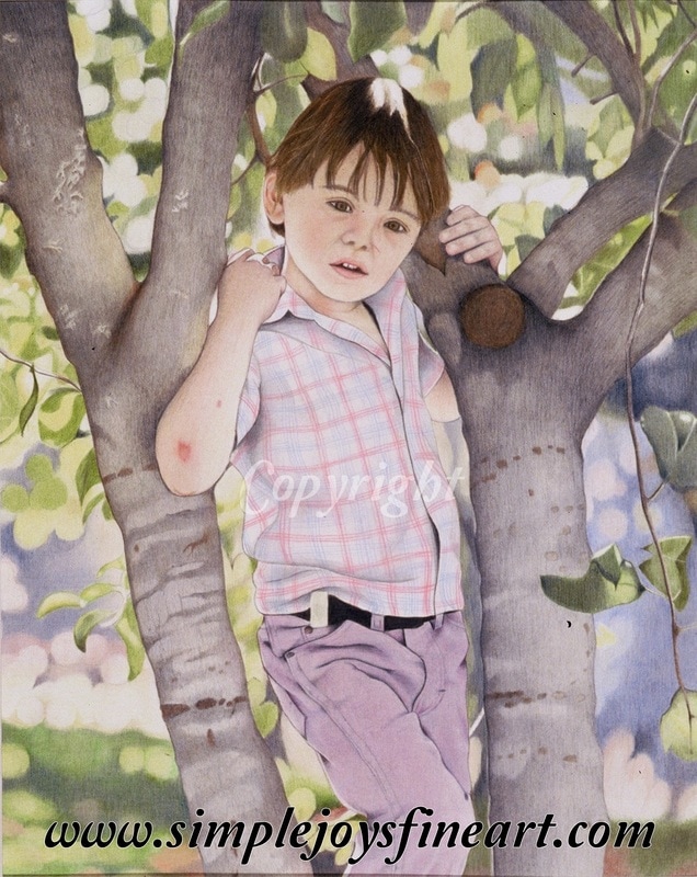
Note: All reference photos used for my artwork are either my own or my sister's (used with permission, of course), unless otherwise stated. What makes a color look real and true? Simply put, the answer is complexity. To add depth to a drawing and to make it look more life-like, you need to use a range of colors for any one particular color. And it's important to take into account real life transparency. Let's look at some examples to further explain what I mean. Keep in mind, I use Faber-Castell Polychromos pencils, which work well for me in getting the effect I need. The most obvious example are shadows. You may want to grab gray or black to draw them. But before you do that, you need to look through the shadow. What is behind it? You need to make sure you draw what the shadow is crossing and then take your gray tones and layer over the top of that. Shadows don't block out color, merely shade it. "Crystal and Friend" (2002) You can see the underlying red tones on the cat, and, believe it or not, many of the colors of her pants are blue and yellow (with some grey and dark greens). The upper, shadowy background has green and yellow underneath. This was my first piece with a person so my face/skin skills were still undeveloped. Even the blackest shades will benefit from 'background' color. I always block in a color before I layer a darker shade or black. With black hair, it is common for me to use reds or blues first. I may also use a color to burnish over the black. Not sure which color to use? Find where the lightest area and use the color you find there. So what about colors? A good rule of thumb when using secondary or intermediate colors is to use the colors that make them, not the color itself. Need purple? Use blue and red. Need orange? Use yellow and red. Need green? Use blue and yellow. You get the idea. Be sure to carefully analyze every color of your reference as you are putting it on paper. See how many colors you can find in the color you are looking at. Obviously some will have more than others. A pale pink probably will only have 2-3 colors you might use. Skin tones on the other hand will use many more. I might use over a dozen on skin tone alone! "Dusty" (2003) While I was still struggling a bit with facial features, this has some good examples of color blending. On his pants, I used light blues and pinks to compliment the purple pencils I used. The trees included browns and some indigo blue to avoid the them being 'flattened with only gray. Primary colors sometimes can be more challenging, but you will probably rarely need a true primary color. Take a minute to think about how often you see primary blue, red, and yellow in natural life. Probably not very often. And when you do, there will be at least some shadows that tell you it's a 3D object. When you look at a blue, red, or yellow, really take the time to use your eye to see what other color(s) may be 'hidden' there. Notes to take away-
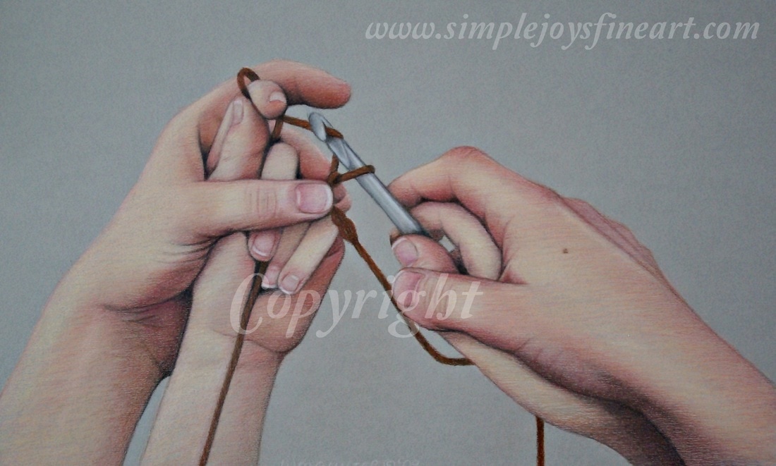
"Guiding Hands" (2009) While this piece still shows room for growth and maturity in rendering skin tone, you can see that colors can be quite complex!
|
Author
Wendi Gunter is a colored pencil artist living in north-central Idaho with her husband, 5 children, and a menagerie of farm animals and pets. Drawing keeps her sane. Archives
June 2019
Categories |
Proudly powered by Weebly
 RSS Feed