Simple Joys Fine Art
|
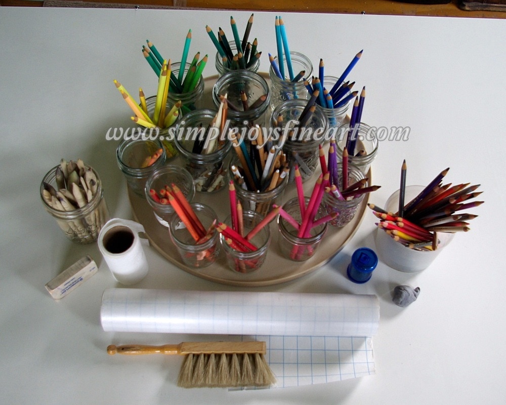
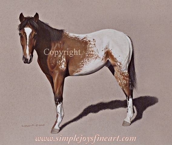
Note: All reference photos used for my artwork are either my own or my sister's (used with permission, of course), unless otherwise stated. I have two confessions to make. One, I love trying new things! And when it comes to colored pencils, there is a whole plethora of things to try! Different brands, wax or oil or water, blenders, erasers, papers and surfaces to experiment on, other mediums to mix with...the list is endless! However, secondly, I'm cheap. Actually frugal, I mean, frugal. We live on a tight budget and so no matter how badly I may want to try the works, the reality is- I have to make-do. So what are the bare necessities, the essentials I can't do without? Below is a photo of my main tools. Pretty basic. I use Faber-Castell Polychromos pencils, which are featured on the turn table and in the container to the right (pencils I'm using on my current project). To the left is a jar of paper stubs for blending. I usually use those for the tight spots. For most areas, I use the universally recognized item next to it. Yes, that's toilet paper. Did I mention I'm cheap? The reality is, it does just what I need it to, blending and mixing color on paper, and you can't beat the price! I usually have a white eraser on hand (the one pictured is not my favorite, but it's what I"m using at the moment) and I'm NEVER without kneaded rubber! It is what I use for lifting color in areas that need shine or lightened for contrast. Or I may use it for areas I have gotten too dark or need color adjustment. I usually have some kind of sharp pencil sharpener and then a soft bristle brush for 'crumbs' if erasing. What's the roll? Frisket film! I'm never without it either! Sticky on one side, I use it for lifting color, such as when making whiskers or hairs in dark areas. Not pictured is workable fixative that I use when I'm done with a piece and pencil extenders, that are actually on pencils in the jars. So there you have it. Nothing fancy. Please understand, there is absolutely nothing wrong with having a studio full of fun things to work with and try! The purpose of this blog post, however, is to reassure artists just starting out that you need not get overwhelmed with all the products out there. You may feel like you need all of it and then feel like you can't afford to get started in the first place. My advice? Splurge on a set of high-quality pencils and a few inexpensive tools and then add things as you learn, gain experience, and can afford them. Tip to take away: A great variety of tools don't make great art. Artists who practice, struggle, learn, and practice some more with what they have available make great art. "Paha", 20x27 Colored Pencil on Bristol Smooth Paper. Original in Private Collection.
2 Comments
You've done all the work of planning, drafting, and coloring, but then comes the big question. "How do I know when a drawing is finished?" Well, I will say this about myself. I have a problem with fiddling forever on things. About the only way to keep me from it is to frame the artwork! That being said, there does come a point when I know a drawing is ready enough. But how do I know? Here are five steps I make sure are completed before I sign my name to any piece of my artwork. These are not steps I wait to do at the end, but I continually repeat steps 1-4 during the entire process. Once I can confidently answer yes to each I know I'm there!
1.) Does it pass technical inspection? This step is generally completed in the early stages, but I remain aware and check on things through the entire process. You know the saying, "Measure twice, cut once."? Same principle. More measuring means less reworking and correcting! When starting a new piece, I use a grid to initially map the subject, BUT I never rely on it fully to ensure lines are correct. I apply several classical drawing methods to check line accuracy. I use my pencil as a Mondrian tool (for horizontal/vertical lines), as a clock angle tool, and as a tool to measure proportions. Training the eye to really see is really important! 2.) Have I gone the extra mile? I've seen a number of artists who finish the mid-tones in a colored pencil drawing and then mistakenly think it is done. Just because everything is colored in doesn't mean it's completed! The final stage should be to make it pop. Be around me very long and you'll hear, "Make your darks dark and your lights light!" so many times it may drive you crazy! Here is the thing though. Our eyes don't transfer what we see to our brain and then to our paper very well. We lose information which can translate into flat artwork 2D in appearance if we are not vigilant. A good rule of thumb is to make the dark areas a bit darker than we think they should be and the light areas lighter. This will give your art a more 3D appearance. This is one of those times it's okay to exaggerate a little! 3.) Have I let it set a bit? I need to walk away from the easel, as in leaving the room. This might be for a couple hours or overnight. This is because I must 'reset' my eye. I need to be able to come back to it fresh. Basically, I need to forget what my work in progress looks like and not be working on it in my head. This way, when I come back to it, any errors or areas that still need more work will jump out at me more clearly. This step is constantly being done! Always, always be stepping away from your artwork, whether you are just periodically stepping back 10 feet while you are working or leaving the room for a bit. It is really important that your eye can freshen and not allowed to get too focused and stuck in a rut! If you work at a drafting table, consider propping your work up so that you can look at it from a several feet away. When I can walk back in and see the 'art', but not 'work', I know I'm done! 4.) Have I had it critiqued? At different times during the creation of a piece, I will make sure I run it by my toughest critics to see what they think. This is usually family and friends I know will be bluntly honest. Online art groups and forums are great, too! No matter how hard we try to be objective, sometimes it takes another party to spot an error that we've missed or who can offer a suggestion for making it better we hadn't thought of. This can be a little nerve-wracking, but doing this now rather than having something come to light after a piece has been released makes it totally worth it! 5.) Have I cleaned up after myself? Finally, when I'm confident that my subject is technically correct and 'popping' and has passed inspection by the critics, I tidy up by sharping lines that are supposed to sharp and remove any smudges that I may have gotten on the space around the subject (if there is no background). I also make sure any white areas on the subject are still clean and any last minute fine tuning is completed. After I have completed all these steps to my satisfaction, I take a freshly sharpened pencil and sign and date my finished, brand-new original! Notes to take away:
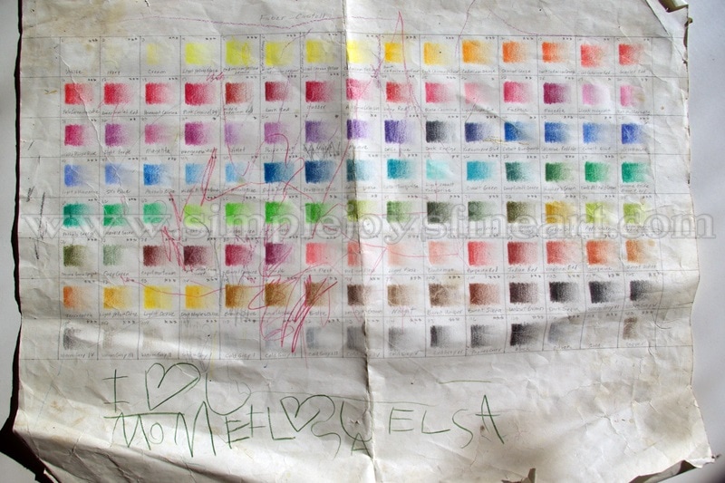
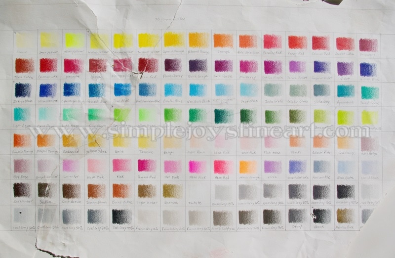
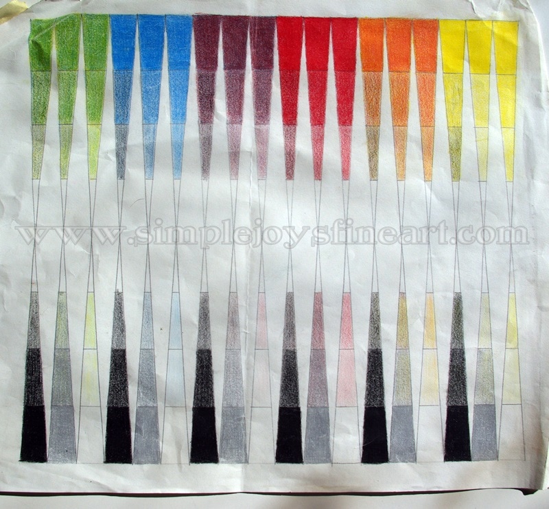
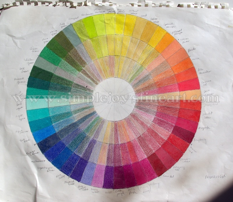
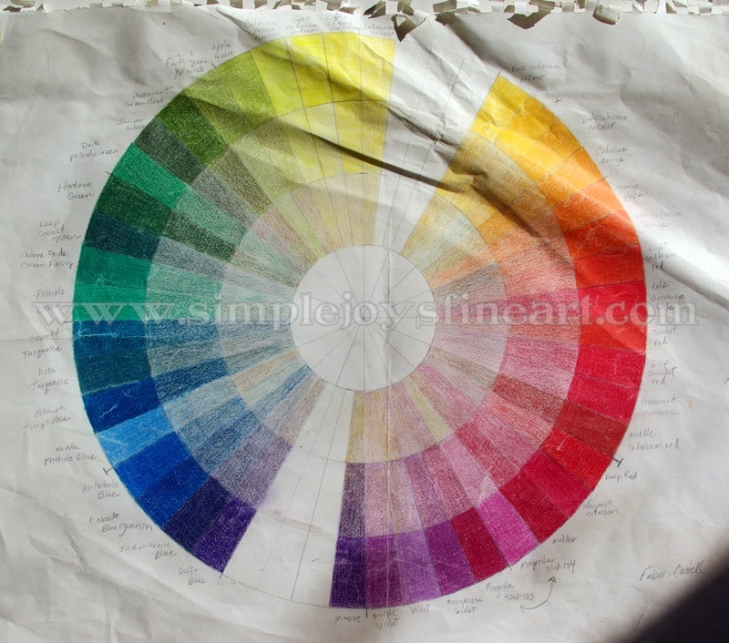
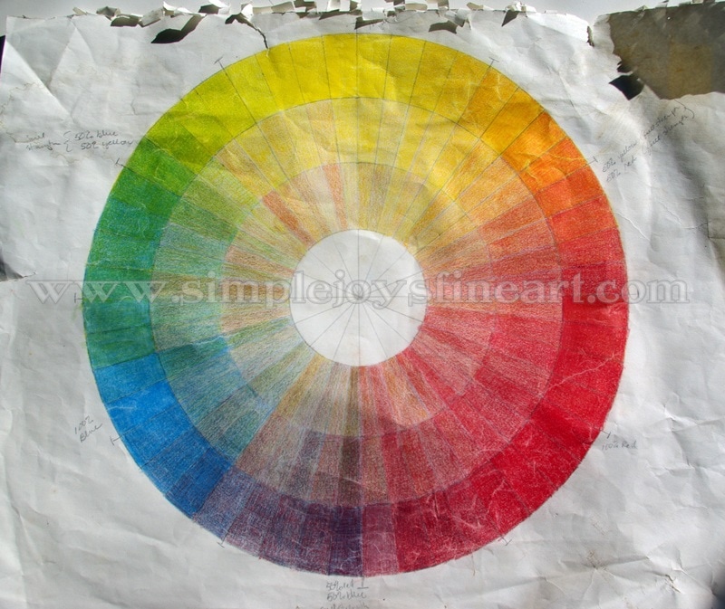
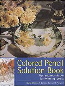
I did not post any pictures with this because there is so much to read, but if you want to view photos of one of my pieces from start to finish you can check out last Wednesday's blog post, From Art to Life. A brief note on the photos accompanying today's blog. These exercises were done almost 17 years ago when I received my full sets of Faber-Castell Polychromos and Prismacolor pencils. These papers have been well loved. They have been taped to my wall easel, hauled to art classes, used as a memo pad by my sweet daughter, and have spent time in boxes and drawers. Some day I will do new ones, but they have been so faithful (and personalized) that I haven't gotten around to it. They have their fair share of wear and tear, but I hope you will be able to look past that and see their purpose. I always like to start with the basics. Last Tuesday, I talked about color complexity. (read that post HERE), but how do you know which colors to choose and mix together? I'm going to assume that you are somewhat schooled in primary, secondary, and tertiary (intermediate) colors and jump to the second challenge- learning the personalities and characteristics of your particular pencils. The mail has arrived and in it is a box and inside the box is a tin of 120 colored pencils, glorious in color (I'm guessing I'm not the only one with a thing for pretty colors...), shiny new, and, depending on the brand, freshly sharpened and ready to use. But first, introductions need to be made! However, where do you start with these complete strangers? I'll tell you what I did. I pulled out a large drawing pad and used each and every pencil! I did several exercises and will explain each below. The first thing I did was make a grid of 120 squares for both the Polys and the Prismas. Then, with each pencil, I made gradient color in a box, making note of which pencil was used. This also helped me to learn what names went with each color as I was a rank beginner as I had only ever used graphite and charcoal. And I learned to control application. One of my most treasured possessions- an autographed copy of my color chart for the Faber-Castell Polychormos pencils. Color chart for the Prismacolors (of which another child tried to turn into a puzzle...) In order to practice shading, I did the exercise below where I started with a color on one side and black on the other and began to overlap the two as I worked to middle. For this exercise, I only used primary and secondary colors. This paper is not marked, but I believe I used the Prismas. Note: When working on a piece of artwork, I never use just one color and black together! This next exercise was a lot of fun as I familiarized myself with layering complementary colors. I drew a circle and divided into 48 'slices'. I then took the brightest/darkest color values and filled in the outside ring. I did this for both brands of pencils. The Prismacolors wheel has more colors than the Faber-Castell Polychormos wheel as the Polys didn't have as many to use of the values needed for that purpose. I made sure to record the name of each pencil I used for reference. Lastly, I overlapped each color with the one across from it, lightening the value as I went towards center. Top: Prismacolors Bottom: Faber-Castell Polychormos I had a blast with the final exercise. This is the one that still gets hauled around a lot to the art classes I hold for children. I ask them, "How many colors did I use here?" I always enjoy hearing their responses and then telling them, "Three!" Yes, I only used 3 Polys for this wheel, the three primary colors- red, blue, and yellow! And, as in the previous exercise, I overlapped complementary colors in the middle rings. If you are just beginning in colored pencil, I encourage to try these and any other exercises you come up with! It really helps to be familiar with each color, what it can do, and how each works together with the others. Ultimately, after doing all these, I decided that I preferred working with the Polys. That was a personal choice and one that these exercises may help you decide for yourself, as well! The ideas and instructions for most of these exercises came from a wonderful book that I used to get started with colored pencil. It is the "Colored Pencil Solution Book" by Janie Gildow and Barbara Benedetti Newton. Click on the title or book image for a link to Amazon. Note: This is not an affiliate ad, just giving credit and making a personal recommendation. Note: All reference photos used for my artwork are either my own or my sister's (used with permission, of course), unless otherwise stated. Last Monday, I talked about the pencils I use (Click HERE to read that post). This Monday, I'll talk about my preferred papers. First off, let me make one thing clear. I love paper almost as much as I love pencils and all their colors! I love trying new ones and I'm always carting home (or ordering) something different to try. Later on, I'll be running some blog posts and papers I'm checking out. For today, though, I'm going to talk about the tried-and-true papers that are my go-tos for my main pieces. The majority of my artwork has been done on Fabriano Artistico watercolor paper, a paper that continues to be my favorite. It is 140 lb and I've used both the soft press and hot press. This is a wonderful paper as it is smooth enough to blend colors without difficulty and colors easily cover the paper, but it has just enough tooth to it that it accepts color readily . And it has no trouble holding up to all the layering! I always buy it 22x30 inches in size. I love putting up that big, blank piece of potential on the easel! My drawings are usually between 11x14 and 16x20 in size so this allows me to have enough space around the drawing itself to experiment with colors. And, of course, so important for professional, long-lasting art, it is 100% cotton, acid-free/pH neutral, and chlorine-free. "Cricket", 19x25 colored pencil on hot press water color paper. Original available, $195. Contact artist if interested. Prints and note cards will be available soon! Another paper that I use often is Bristol board, either vellum or plate and I purchase 2-ply or greater. Vellum has more tooth than the plate, meaning it's easier to achieve saturated colors and the heavier ply handles the work load. It is a bit less expensive than the Fabriano Artistico and the brands I purchase are 100% cotton and acid-free. And, like the rest of my paper stock, it arrives to the studio in the larger sizes. "Caleb", worked on 9x12 board, a little smaller than usual for me, this little guy (who is not so little anymore!) was my first piece on Bristol vellum. This is one of my favorites, even though there were a few firsts on it that I would probably change if I did it now. However, it definitely got me hooked on Bristol! Original in private collection. Lastly is the newest paper I've tried and completed pieces on, Canson Mi-Teintes drawing paper. I've found drawing on colored paper to be exciting. The colors layer and blend differently and you do things a bit backwards. It involves having to think in the 'negative', like a photo negative. Instead of shading in the dark parts on a white background, you are tinting in the whites on a dark background. And you can use the color of the paper when blending the needed colors. I find this challenging and fun! And pieces generally come together faster as I don't have to layer and mix as much. This paper is smooth on one side and a bit more textured on the other for your preferred surface. I usually work on the smoother side. All of the colors offered are acid-free and highly light-resistant. This is something very important to look for when using colored paper as you don't want paper fading or 'bleaching out' after all your hard work! The only con for me is it a lighter-weight paper than I'm used to using as it's only 98 lb. This requires gentler handling to avoid finger-dents and sensitivity when layering or making indentations with the pencil. Although the range of colors are not offered, I've discovered that it comes as a board. Guess what I'll be ordering next! "Christmas Colt", 13x20 Colored Pencil on Canson Mi-Teintes Colored Paper. I'm not sure which was more fun- meeting this little guy or drawing him! Original in Private Collection. So there you have it! A look at the papers I most commonly use and why! I'm looking forward to some future paper reviews and I'd love to hear what your favorites are! Want to try one of these papers yourself? Here are some links to what DickBlick offers. Feel free to shop around, of course!
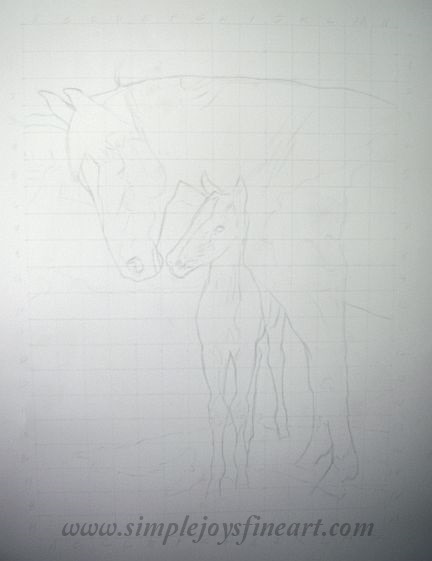
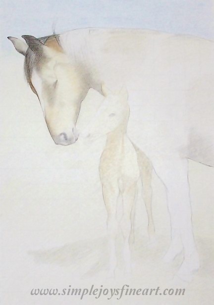
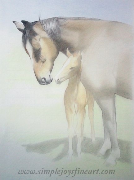
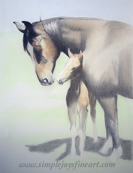
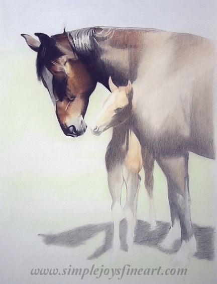
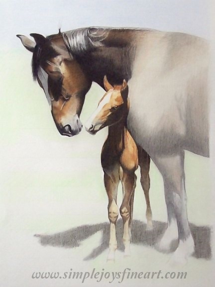
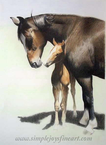
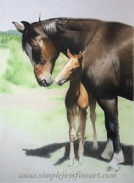
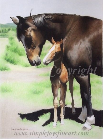
Fabriano Artistico Bristol Paper and Boards Canson Mi-Teintes Note: All reference photos used for my artwork are either my own or my sister's (used with permission, of course), unless otherwise stated. This Wednesday's Work in Progress will be a blog post. To kick things off, I thought I would walk through the process of a completed painting to give you an idea of how I do things. I thought I would use the piece currently on display on the "Easel" page, "Tender Moment", in order to compliment it by giving the behind the scenes of its creation. Descriptions are found under each image. I work from reference photos and it is common for me to graph out the subject onto the paper, particularly with more complex pieces. I mostly just want to lay out the outside lines. I do not do this with charcoal and graphite drawings as I believe in good draftsmanship, but colored pencil involves so many hours of coloring and layering that I don't like to take chances that an error may ruin a piece, such as black shadow being left on white! The image above has had the lines darkened significantly so that you can see them, however, they are put onto the paper very lightly and erased as soon as I have had a chance to block in a bit of color to make sure the technical parts are all correct. Incidentally, this is not my favorite part of the process! I try to rely on my eye as much as I can during this phase as the squares are distracting and can make one lose sight of the big picture. In this image, I'm starting to block in some color. I've got some base colors in and have started to define the shaded areas. Here, I am continuing to block in color, but you can see my focus has now shifted to the horses' heads, mainly the mare's. I always like to get the heads, particularly the eye areas, done first as this is the most critical part of any painting. If eye and expression are not correct, it won't matter how good the rest of it is! That is what draws people! Shadow areas continue to be defined and darkened. This image appears a bit grainy. Part of it is the photo itself, but also because I've been using the side of the pencil on the larger areas to get the color in. It will be smoothed out as I go along! I've returned to the mare's head to further add color and bring out the darks and lights to really make it pop. And it's on to the foal! This was the funnest part of the whole piece! I loved seeing this little one coming to life! He also came together easily and I was able to finish him up rather quickly. Next was drudgery. Time to fill in the mare's body colors. Larger areas are always harder. You can once again see the grainier look which were smoothed out later on once I knew I had gotten the values right. You can see I have also darkened the shadow on the ground. Almost done! My least favorite part is always saved to the end- landscape! I've gotten the greens and ground started blocking in and I've finished the sky. And it's all done!
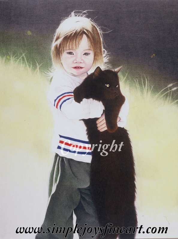
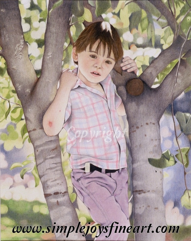
The final stage, fine tuning, is actually one of the longest steps. This is the time when I smooth out all the grainy sections and make sure any small dots of paper still showing through are filled. It is also where I work to make sure that my darks are dark and my lights are light! Note how dark the ground shadow has gotten. Fine tuning is taking a piece one step further than done to make sure it looks it's best! This is the time I step away (or leave the studio) and come back the most! Anything that needs more work becomes obvious this way. When it gets to the point that I can't believe I did that, it's done! I hope you found this helpful and I am looking forward to presenting new works in progress! Prints and note cards of "Tender Moment" can be found in the Shop! Note: All reference photos used for my artwork are either my own or my sister's (used with permission, of course), unless otherwise stated. What makes a color look real and true? Simply put, the answer is complexity. To add depth to a drawing and to make it look more life-like, you need to use a range of colors for any one particular color. And it's important to take into account real life transparency. Let's look at some examples to further explain what I mean. Keep in mind, I use Faber-Castell Polychromos pencils, which work well for me in getting the effect I need. The most obvious example are shadows. You may want to grab gray or black to draw them. But before you do that, you need to look through the shadow. What is behind it? You need to make sure you draw what the shadow is crossing and then take your gray tones and layer over the top of that. Shadows don't block out color, merely shade it. "Crystal and Friend" (2002) You can see the underlying red tones on the cat, and, believe it or not, many of the colors of her pants are blue and yellow (with some grey and dark greens). The upper, shadowy background has green and yellow underneath. This was my first piece with a person so my face/skin skills were still undeveloped. Even the blackest shades will benefit from 'background' color. I always block in a color before I layer a darker shade or black. With black hair, it is common for me to use reds or blues first. I may also use a color to burnish over the black. Not sure which color to use? Find where the lightest area and use the color you find there. So what about colors? A good rule of thumb when using secondary or intermediate colors is to use the colors that make them, not the color itself. Need purple? Use blue and red. Need orange? Use yellow and red. Need green? Use blue and yellow. You get the idea. Be sure to carefully analyze every color of your reference as you are putting it on paper. See how many colors you can find in the color you are looking at. Obviously some will have more than others. A pale pink probably will only have 2-3 colors you might use. Skin tones on the other hand will use many more. I might use over a dozen on skin tone alone! "Dusty" (2003) While I was still struggling a bit with facial features, this has some good examples of color blending. On his pants, I used light blues and pinks to compliment the purple pencils I used. The trees included browns and some indigo blue to avoid the them being 'flattened with only gray. Primary colors sometimes can be more challenging, but you will probably rarely need a true primary color. Take a minute to think about how often you see primary blue, red, and yellow in natural life. Probably not very often. And when you do, there will be at least some shadows that tell you it's a 3D object. When you look at a blue, red, or yellow, really take the time to use your eye to see what other color(s) may be 'hidden' there. Notes to take away-
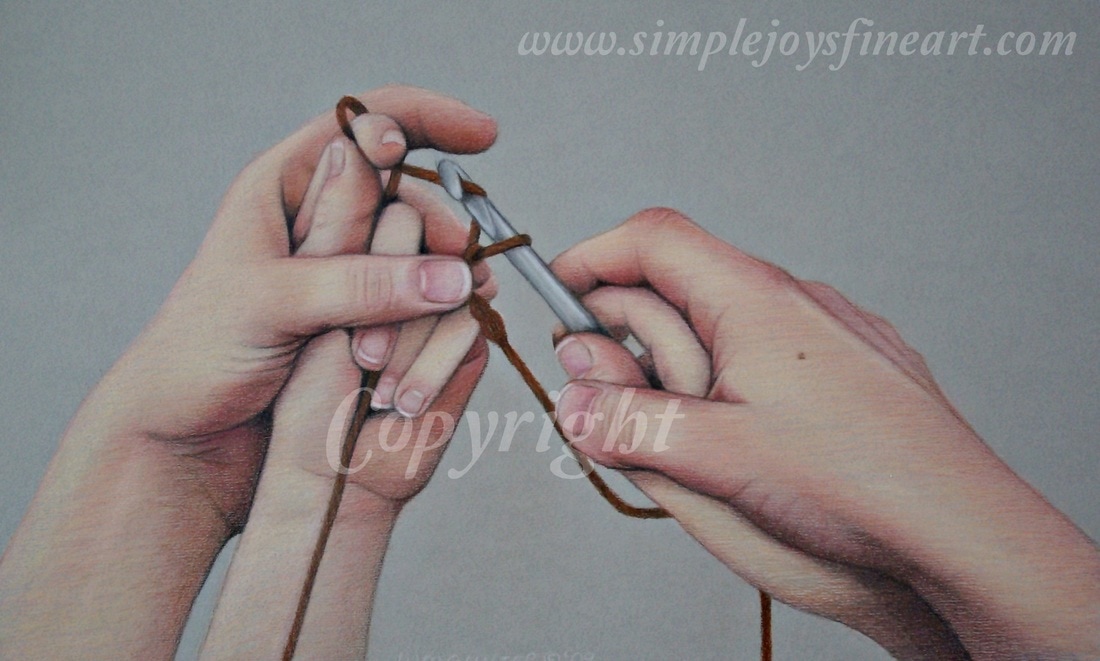
"Guiding Hands" (2009) While this piece still shows room for growth and maturity in rendering skin tone, you can see that colors can be quite complex!
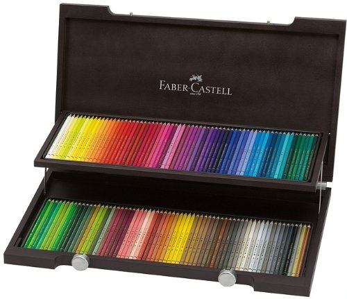
I've always loved to draw. From the time I could hold a pencil, I was sketching out horses. For years, I used just graphite pencils and charcoal which, as it turns out, was laying a good foundation for what was coming next! In 2001, I became intrigued with the idea of using colored pencil. I was ready to move beyond black and white and gray scale! I was undecided on which ones to use, but I knew that I wanted a professional, high-quality brand. I ordered complete sets of 120 of both Prismacolor and Faber-Castell Polychromos pencils. I had used Prismacolor some already, but wanted to experiment with the Polychromos pencils. I'm so glad I did! I discovered that Faber-Castell offered pencils with less of a learning curve for me. I was hooked and they have been the main medium I have used ever since! I love their softness and that I can 'smear' the colors much like I do with the graphite and charcoal. It is much easier to blend colors on paper and to lift color off where needed. And mistakes are more easily corrected. I'm not sure why Faber-Castell describes them as non-smudge, but I'm happy that I can get the color to 'move around' on the paper! So what makes these pencils different? Polychromos pencils are oil-based versus waxed-based. Waxed-based don't flow as smoothly and are harder to layer, mix, and achieve gradient color blends. As an example of what I mean, think of the cheaper colored pencils you've used. It was hard getting a vibrant color right? That is because of the amount of wax used as a binder (more wax, less color). While professional quality pencils don't use as much and therefore offer better color saturation, they can still be a bit more challenging to use. Oil-based are similar to pastels when applied to paper and more forgiving! Look at all the pretty colors! Some other perks of Faber-Castell Polychormos pencils?
They don't break nearly as easily. Thank goodness! Because, yes, I've dropped them (I'm not known for my grace). And you know what? I've never had a broken one! Ever had a pencil that you couldn't sharpen or use because its insides were in pieces? Not with Polychromos pencils! The pigments used are incredibly light-fast. They are said to resist fading for over 100 years! Perfect when you are wanting to create long-lasting, professional quality artwork. Another reason I chose them. And their colors are matched to their other lines! Is there a down-side? Well, yes, but not one I've not been able to overcome so far. It's actually the flip-side of their upside. I love how easy it is to blend the color I need as the colors are a bit translucent. However, this means that they are not necessarily opaque so it can be harder to achieve intense colors. But it can be done! Am I open to experimenting with other brands and mediums? You bet! But Faber-Castell Polychromos pencils will always be my favorite. And you can take that to the bank! Here's chart with the Polychromos colors and their light-fastness ratings: http://www.fabercastell.com/service/color-charts While more expensive than most other brands, I've found Jerry's Artarama has them at a good price. And you can get them open stock, as well! http://www.jerrysartarama.com/drawing-illustration/colored-pencils/faber-castell-polychromos-pencils-and-sets A great blog post from Color Your World comparing Prismacolor pencils to Faber-Castell Polychromos pencils: http://coloururworld15.weebly.com/a-coloristas-blog/faber-castell-polychromos-vs-prismacolor-pencils-review |
Author
Wendi Gunter is a colored pencil artist living in north-central Idaho with her husband, 5 children, and a menagerie of farm animals and pets. Drawing keeps her sane. Archives
June 2019
Categories |
Proudly powered by Weebly
 RSS Feed